Client:
Downtown Lincoln Association
Role:
Lead Designer
Skillsets Used:
Stakeholder interviews, wireframing, prototyping, design systems analysis
A Thriving Downtown Lincoln
 Visit Live Website
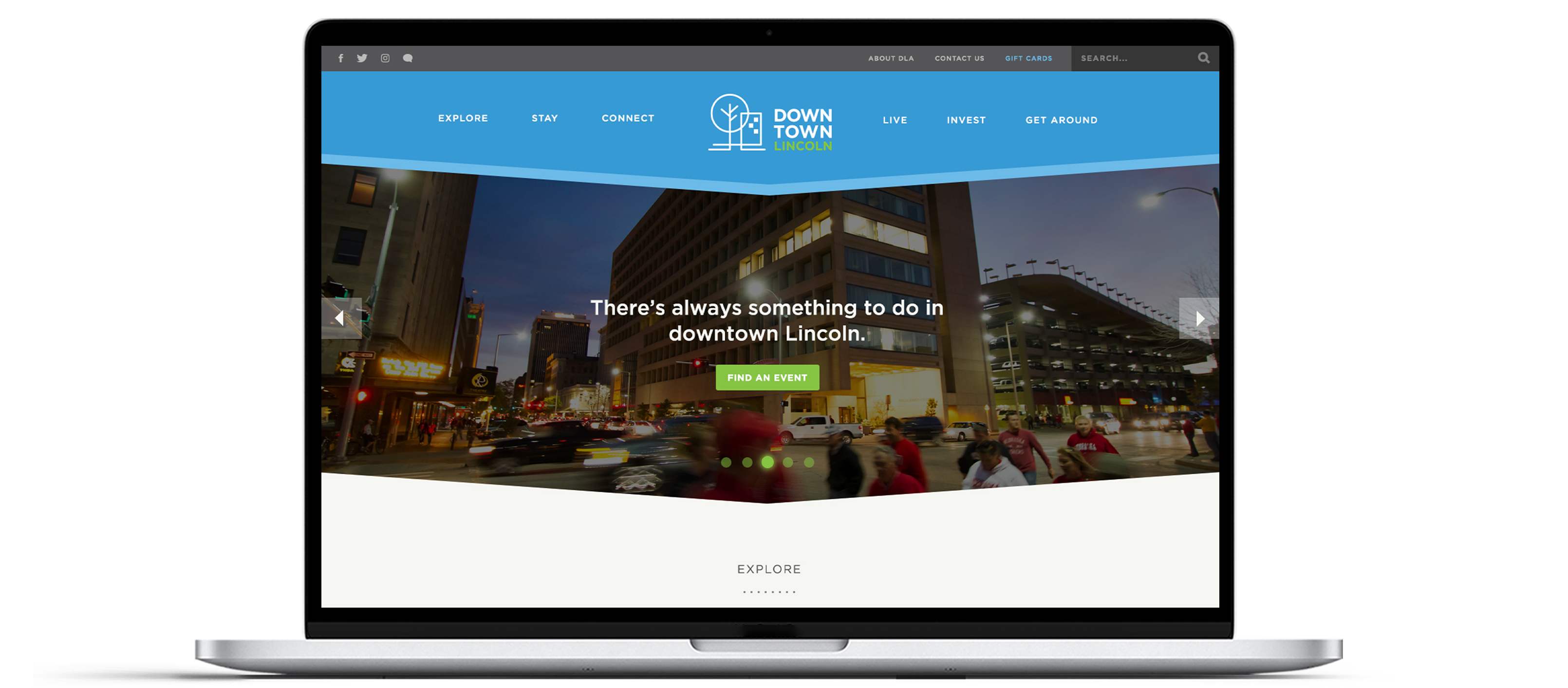
The Downtown Lincoln Association’s mission is to champion initiatives that enhance the vibrant downtown neighborhood of Lincoln, Nebraska. I was approached to design the experience and interface of their latest website refresh. I collaborated with a developer and association leaders to create a dynamic experience for current residents, potential residents, and visitors with a focus on college students and a younger demographic.
- Content for the association was divided among two different sites. One site focused primarily on providing general information about downtown Lincoln and another site focused on mapping areas of interest. We also needed to eliminate duplicate information by revisiting and reorganizing the site architecture.
- Lincoln is a college town, and the old sites were not effective in engaging a younger demographic.
- Increased investor and development interest is crucial in maintaining an ever-growing downtown community.
- Gift card purchases are an important revenue source for the association, so the new design needed to promote this whenever possible without coming off as too sales-y.
From a visual standpoint, the association's brand involved a lot of nice angled shapes and lines. I emphasized that within the interface by creating large, angled edges to act as section dividers. Their library of icons needed to be expanded, so I created some additional icons that fell within a similar style. I would have loved to update their current icon library to create a more cohesive visual appeal, however, there was a large volume of existing printed pieces featuring their current iconography staying within budget was crucial.
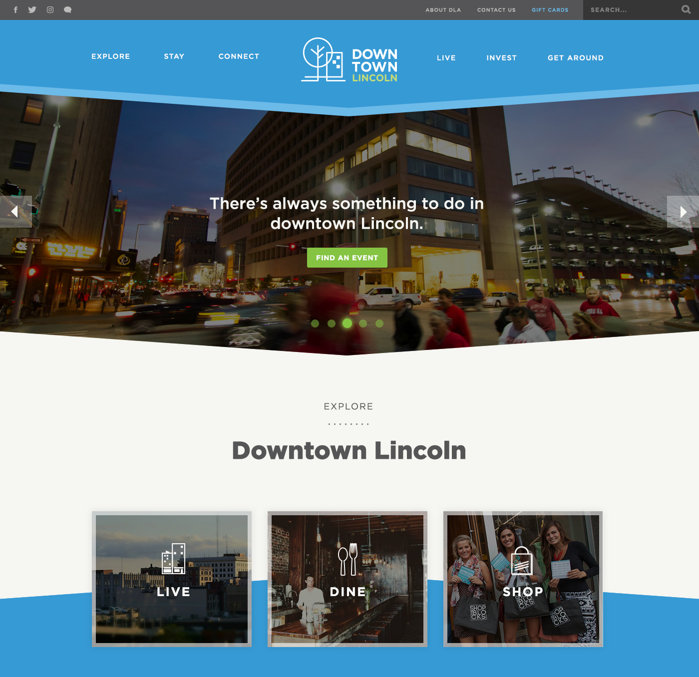
The previous site wasn't taking advantage of the immense real estate available on desktop views. It seemed constrained and claustrophobic. I opened the layout significantly, increasing white space for easy skimming and readability, while staying mindful of mobile experiences.
With a focus on a younger demographic, the association wanted to place a greater focus on lifestyle activities. I designed three prominent calls-to-action allowing users to easily navigate to landing pages for living, dining, and shopping recommendations.
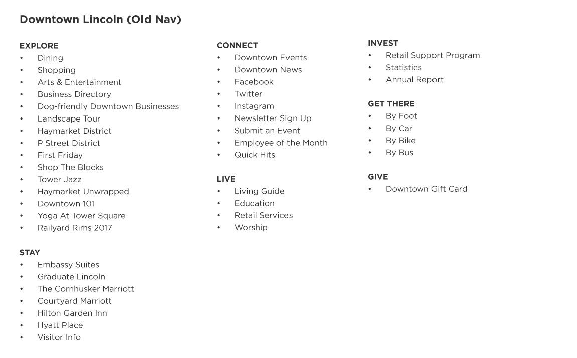
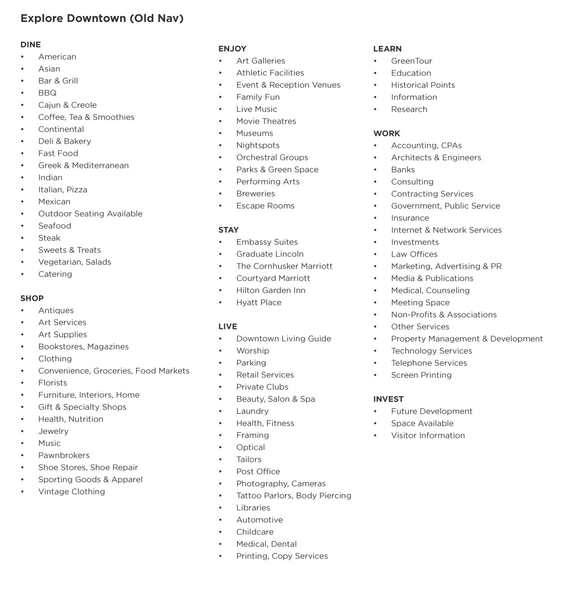
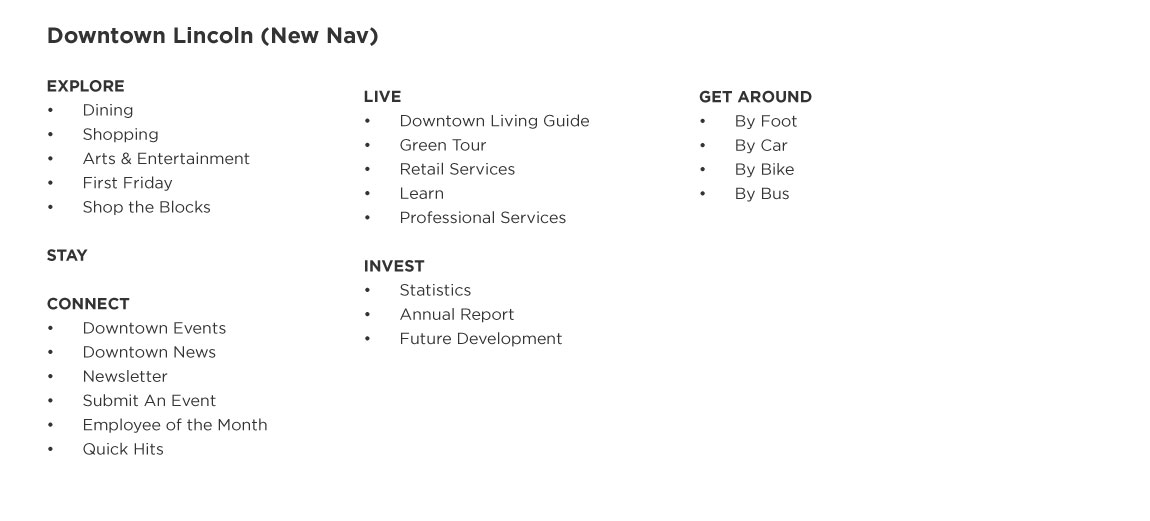

The previous information architecture for each separate site was fairly redundant and cumbersome. We identified and eliminated the redundant content using card sorting, and incorporated the leftover content into existing pages. Because the site contains a lot of cross-referenced content, it was imperative to include breadcrumb links to provide users with additional context.


The sub-menus for each primary navigation link unnecessarily contained links to categories. I optimized the sub-menus to include more relevant information instead, keeping the category links on the landing pages. The former site also used dropdown menus to list categories, but usability testing proved that a button-focused layout is easier to navigate than dropdown menus. I also changed the microcopy from "Filter by Group" to "Filter by Cuisine" to remove ambiguity.
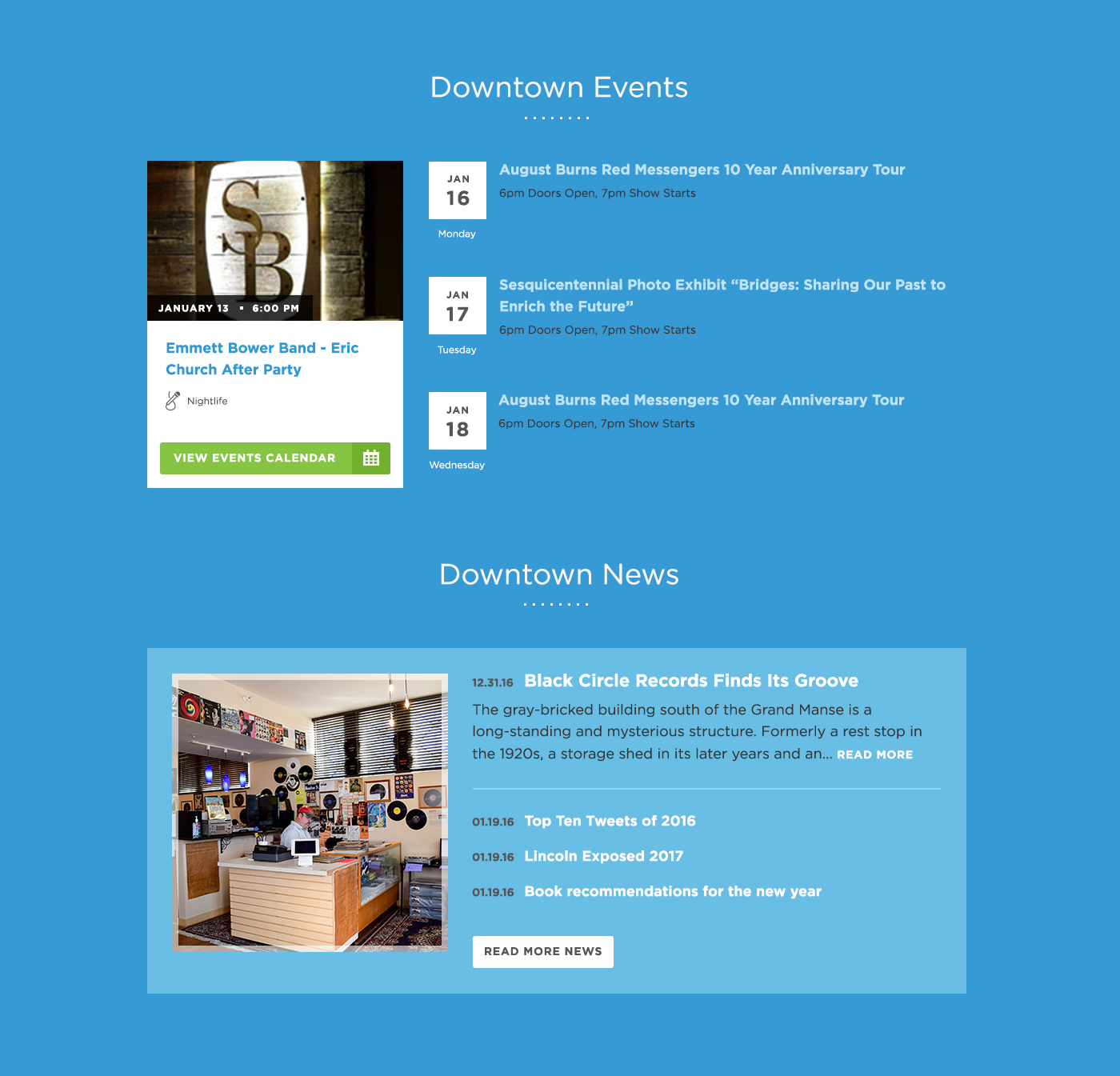
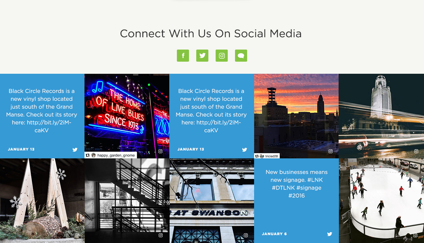
To keep Lincoln residents informed, I added a latest news section, latest events section, and a visual social media presence featuring current Twitter and Instagram posts. The universal footer also contains a newsletter sign-up link. The steady stream of updated news and events also signals to investors that downtown Lincoln is a thriving community.
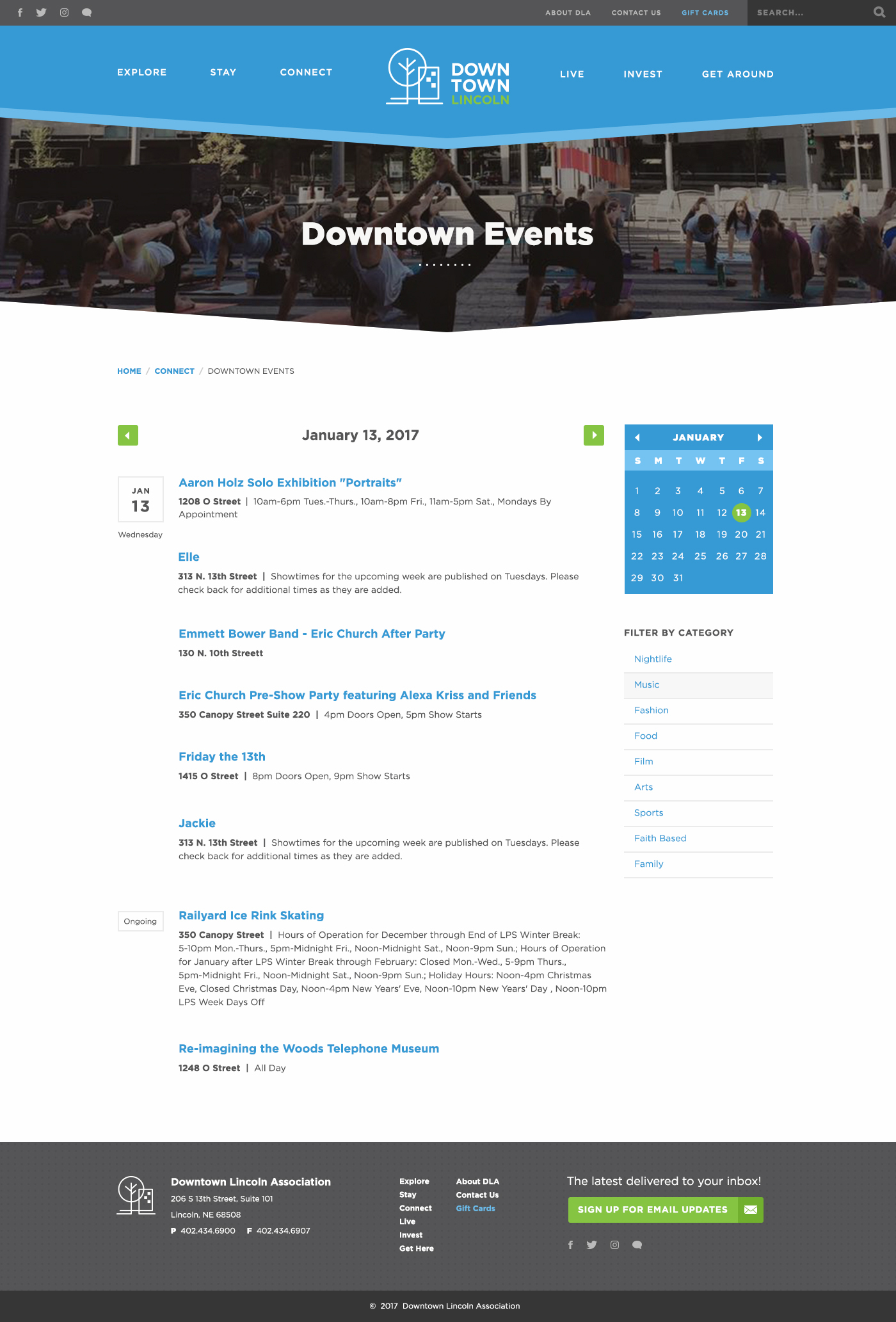
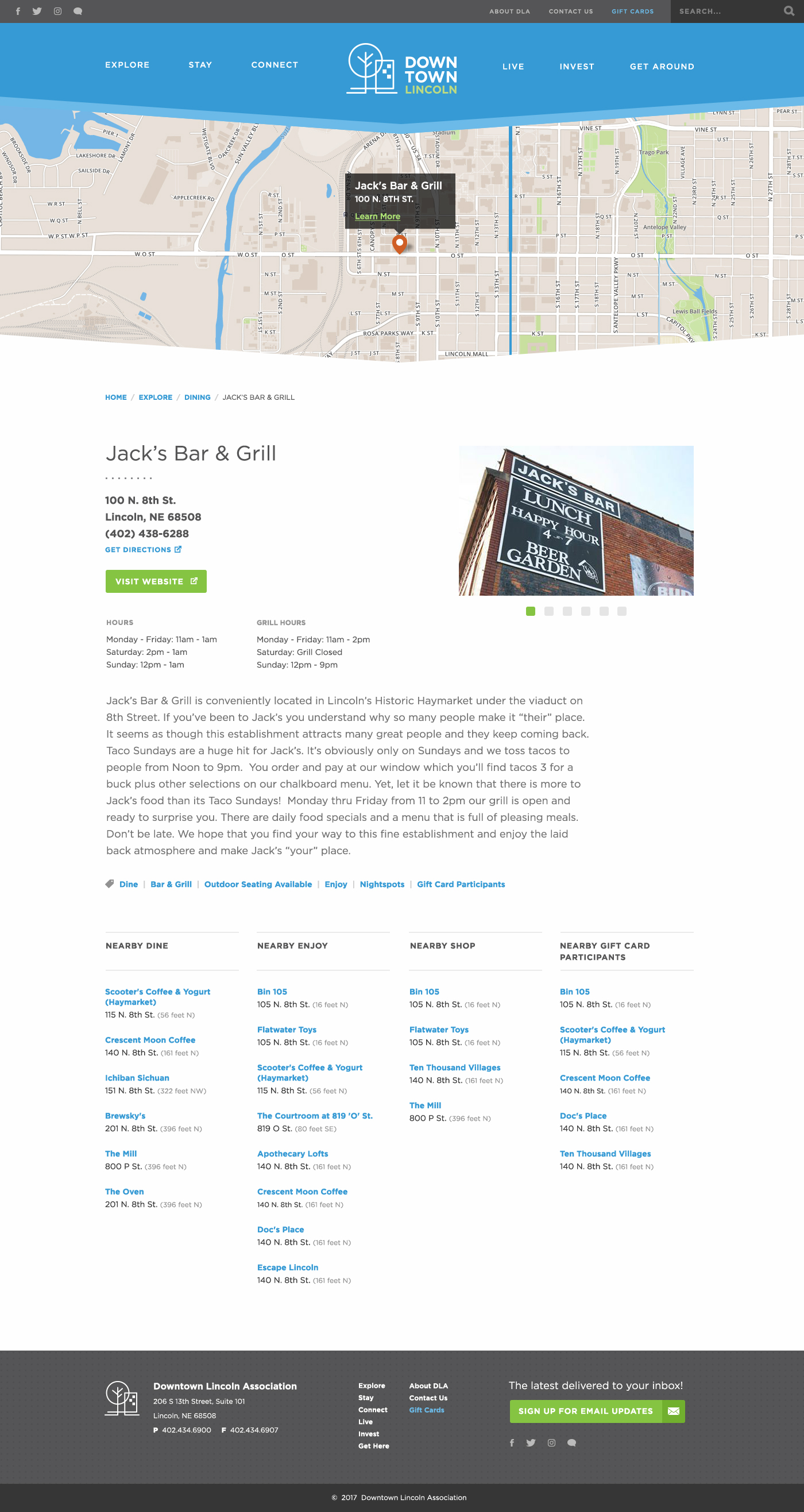
Each destination (i.e. restaurants, shops, etc.) has a dedicated detail page that provides the user with information regarding its mapped location, date and time (if applicable), website, social media links, and destination category. To accommodate the mobility of a downtown visitor and promote a feeling of connectedness and community, we included a list of nearby attractions and their distance from the current location. Interactive maps with location tooltips also allow locating nearby attractions for the more visually-oriented users. This was also a great opportunity to remind our users of the locations that accept the Downtown Lincoln Gift Card.
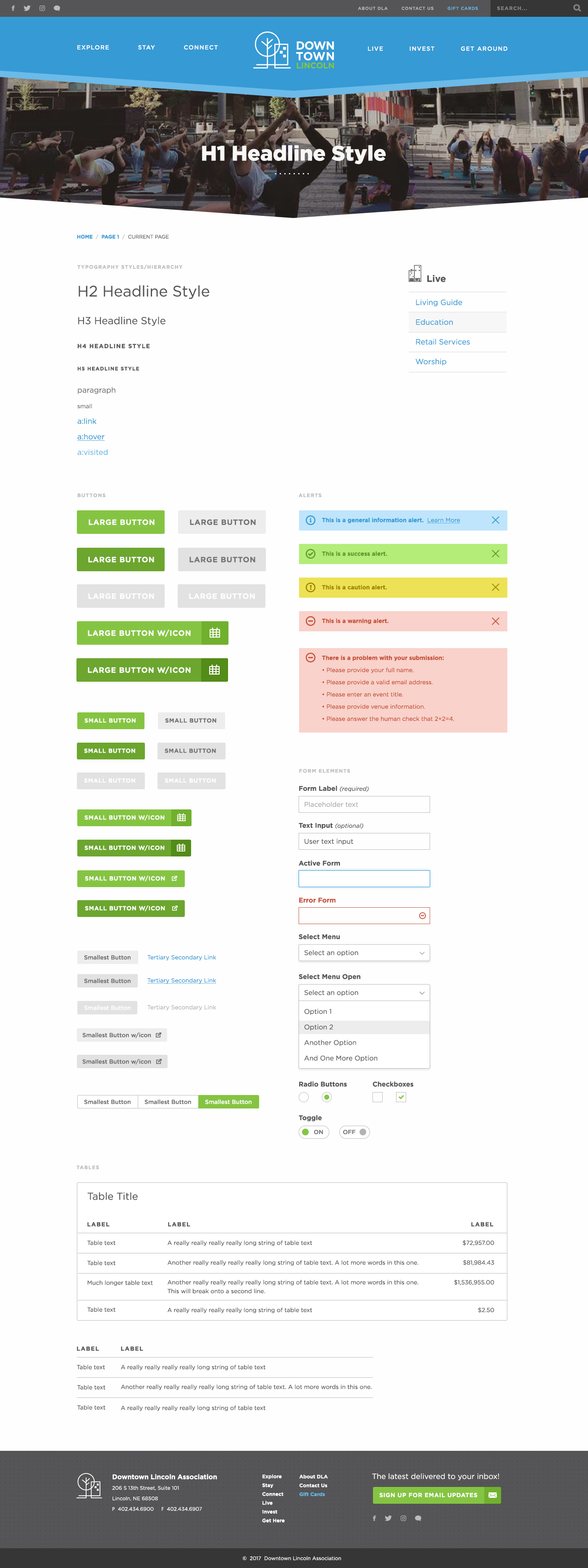
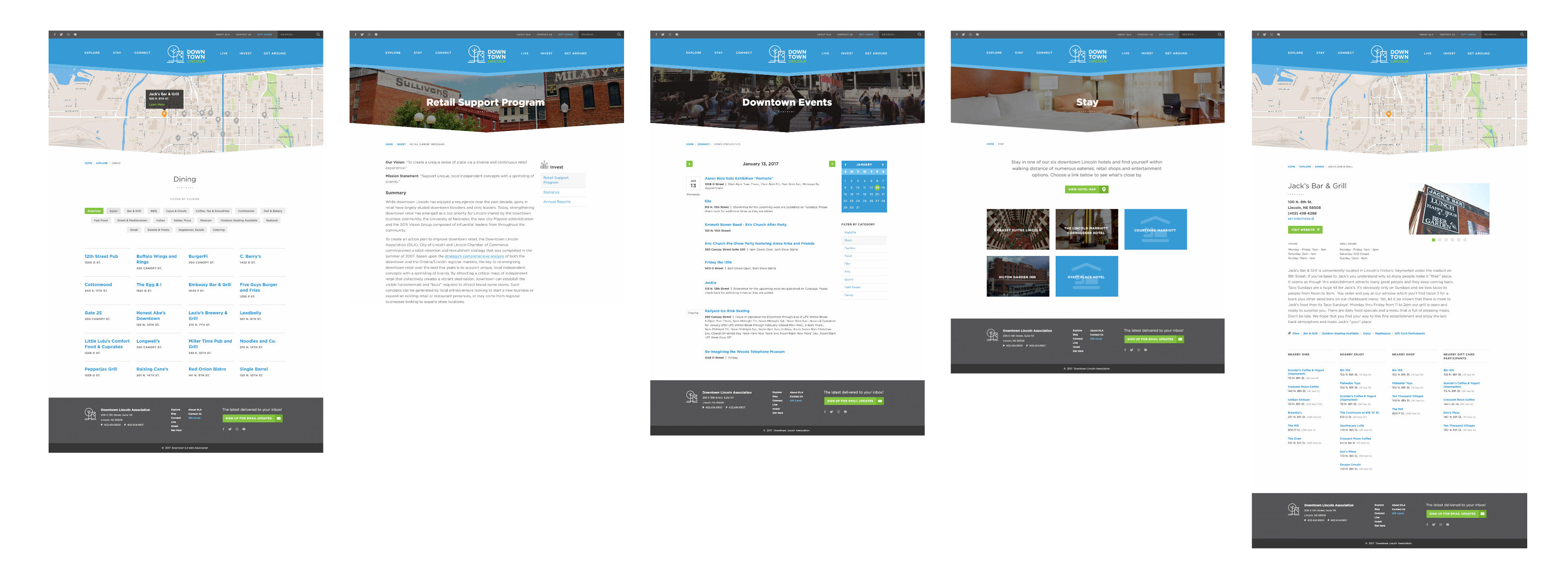
Once I addressed opportunities for usability improvement, I focused on creating a modular design system (using Brad Frost's Atomic Design methodology). This system culminated in five page templates applied to all website content: a category landing page (i.e. "Explore", "Shop", "Dine", etc.), a general detail page, a directory page with an interactive map, an events page, and an establishment/events detail page. This would provide the association with plenty of content types to promote their city effectively without over-engineering the website.
