Client:
Merit America
Role:
Design Director
Skillsets Used:
Stakeholder interviews, A/B Testing, Voice and tone exercises, Logo development
Professional Development for Working Adults
 Visit Live Website
Millions of Americans are underemployed, while employers are struggling to find talent with the skills they need. One of the greatest challenges facing our economy is whether we can close this skills gap at scale. Merit America envisions a world in which anyone can advance their life based on merit, not money. They provide a path from low-wage work to skilled careers, by preparing talented adults without college degrees for in-demand roles. Established in 2017 as a woman-owned organization, Merit America provides an alternative path to upward mobility and believes deeply in their learners’ potential to learn new skills and advance their career. They do this with a program that provides both flexibility and support as their learners gain the subject matter skills and professional skills employers are looking for.
As the design director and a founding team member, I collaborated with the CEO, a program director, and a director of strategy to define and evolve the organization's brand—an organization in its infancy (the name changed from “Level Up America” during my time there). I was also brought on to design the organization’s online portal to track learners’ progress throughout our program, which you can read about here.
- We were working with a blank canvas, with a million questions to be answered. How did we want to be perceived? What do we want folks outside of the company to say about our organization? How will we set ourselves apart from other organizations in this space?
- Initial competitive analysis revealed a significant amount of less-than-savory players within the education-to-employment space. Building trust became a top priority.
- I worked in an ever-changing, fast-pace environment, as every day brought new learnings. I needed our design to be modular and flexible, while also engaging.
- Our limited budget required us to ruthlessly prioritize brand initiatives. We also needed to build our website with no development budget, so we used Squarespace as our website platform.
Merit America was built on the notion of constantly experimenting and learning. We leaned into failure and heartily celebrated our successes. As we worked together to shape the program's vision, our model adhered to three notions:
- Partner with major employers and use labor market data to understand the specific competencies required for skilled roles, with an initial focus on IT Support.
- Operate a learning program aligned to those roles that teach technical and professional skills, through a mix of online learning, in-person coaching and peer support—creating the most effective, accessible and scalable model in the field
- Recruit working adults who don’t have college degrees and can’t participate in full-time training, but have potential to succeed in our program and the careers that follow – through direct outreach and through partnerships with community organizations and employers
Once I began understanding our goals and the education-to-employment landscape, I collaborated with the Director of Program to determine our target audiences:
- Learners: Predominantly female, they attended college for less than 4 years and dropped out primarily due to expense. They work in low-growth jobs at risk of automation. Merit America offered stipends to learn, so this demographic is motivated by the opportunity of getting paid to learn rather than spending their own money and too much time to earn a college degree.
- Coaches: Coming from a wide mix of professional backgrounds, some have previous experience with career coaching. They are primarily motivated by the opportuntiy to provide a positive impact on the learners' lives.
- Employers: Merit America partners with companies of all sizes. From national conglomerates to small-business partnerships, we place our learners in their preferred settings when possbile. Employers are motivated by opportunity to close the skills gap and hire pre-vetted candidates.
The first official elements I developed for Merit America's brand included our brand voice, color palette, and typography. These would provide the foundation and legitimacy of our original flyers and website used to recruit learners for our inaugural Alpha Cohort: our first group of 15 learners selected through a rigorous recruitment process.
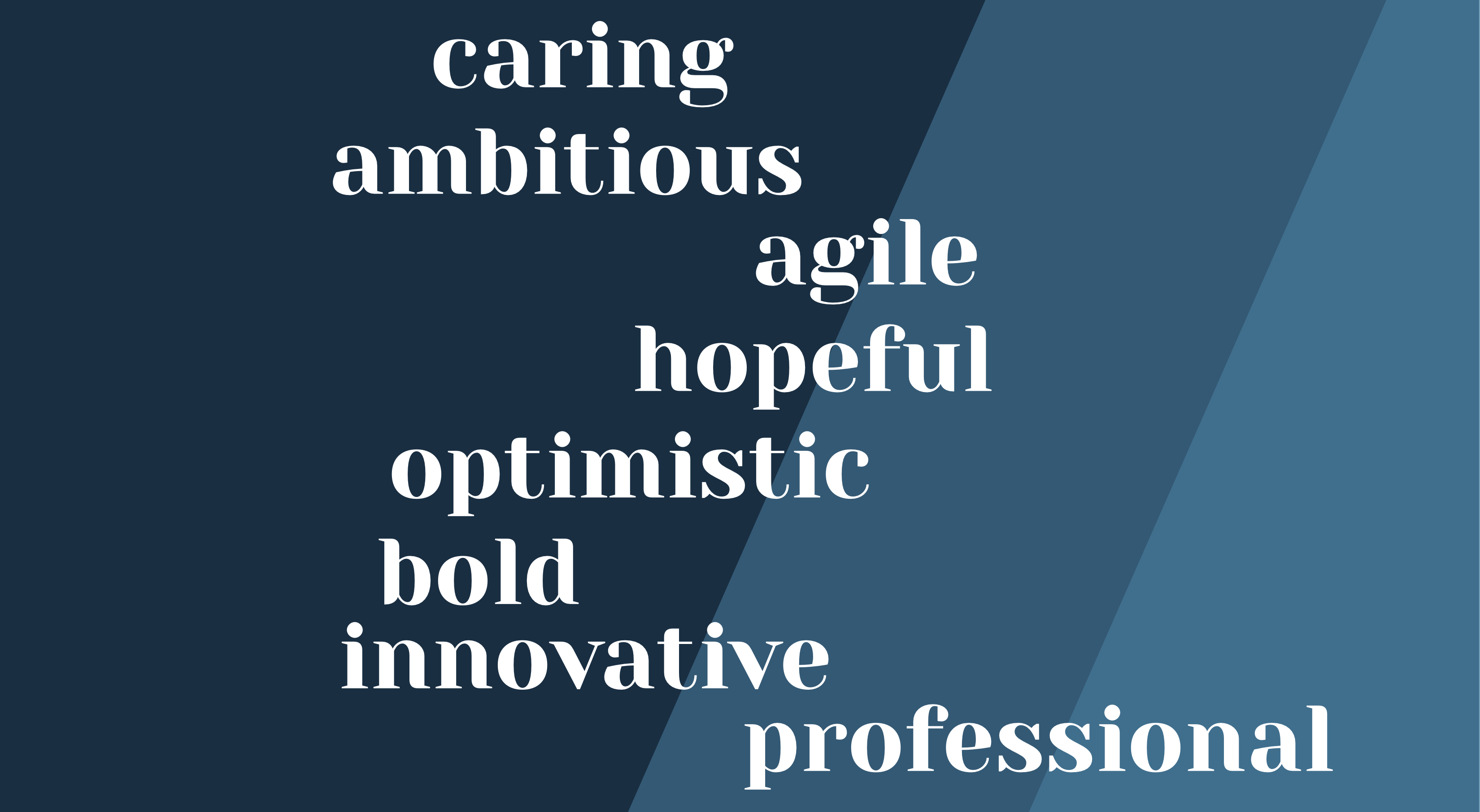
Voice: Through a brainstorming and word association activity, we narrowed down our brand voice to a blend of obvious and surprising terms. Our learners, on the whole, had experienced great professional and academic hardships, so it became paramount to cultivate an environment that would take them seriously, empathize with their story, and motivate them to always have hope for the future.
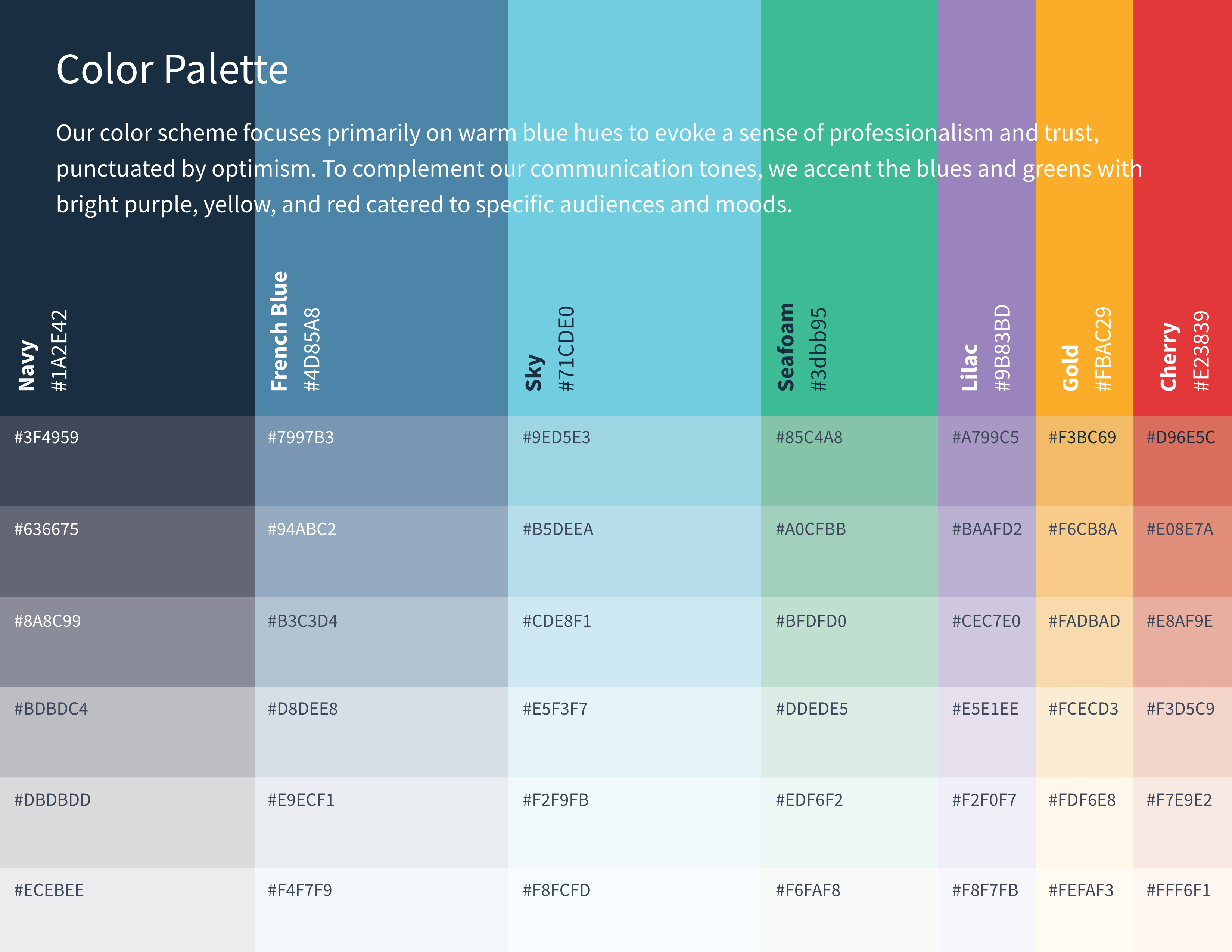
Color Palette: The dominant colors we chose were shades of blue. While emulating “trust” and “professionalism”, I chose brighter shades that evoked “optimism” and “innovation”, rather than traditional shades that might come off as too convservative or overly traditional.
The accent colors, used sparingly, provide a fun and ambitious tone when necessary.
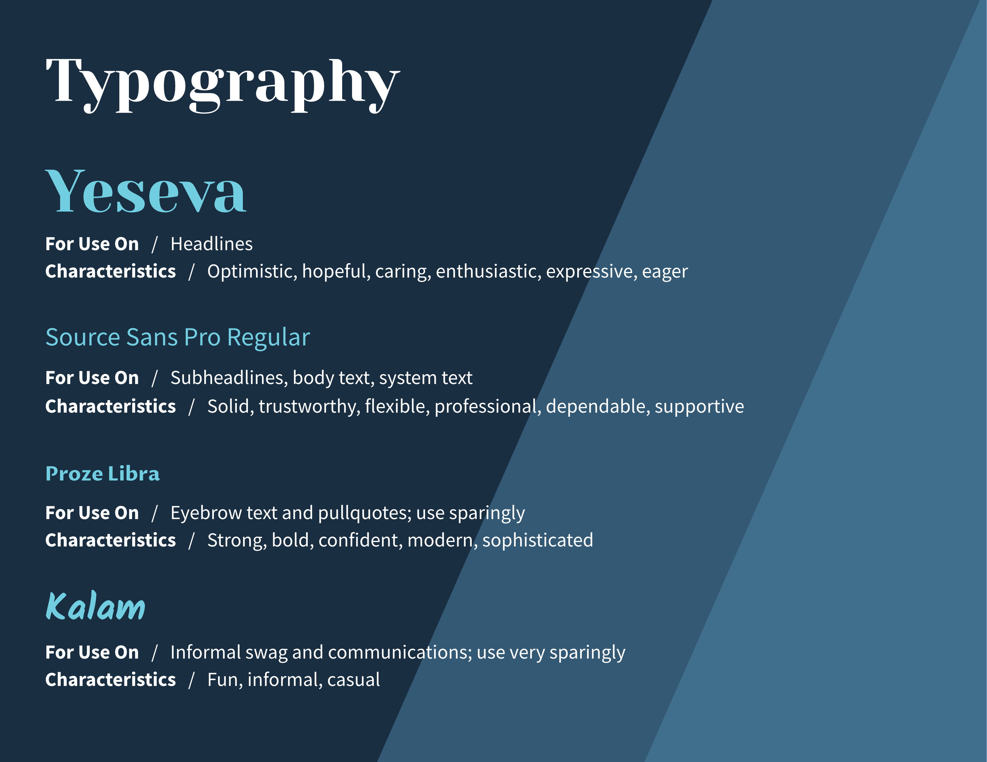
Typography: I chose open-source typefaces Yeseva, Source Sans Pro, Proza Libre, and Kalama.
- Yeseva provided a modernized version of a classic font style to promote a feeling of trust, yet the slightly upturned x-heights emoted optimism and caring.
- Source Sans Pro is the solid foundation upon which our communication would flourish. Flexible in weight and visually underwhelming, it gets out of the readers’ ways and lets them digest our messages unencumbered
- Proza Libre is used sparingly, and provides us with a visual break when needed. We apply this font mostly on quotes and testimonials, or to highlight interesting facts.
- Kalam, applied in exceptionally rare instances, was only used on informal marketing materials and internal swag.
It was time for a logo. In keeping with our optimistic yet professional voice, I was inspired by a phrase that had come to me during a brainstorming session: our learners build their own career ladders; we simply hold it steady for them. I created the logomark by stylizing the “M”, with one of its ascenders emulating a ladder. The smaller shape beneath the ladder is a stylized “A” and the logomark in keeping with the aforementioned sentiment. The upward angles in the logo evoked a sense of optimism and motivation that were eventually applied elsewhere in our branded materials.
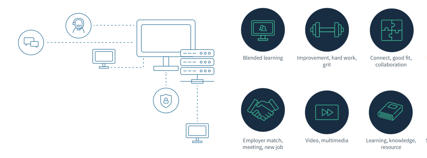
We originally had no existing custom photography and I wanted to avoid relying too heavily on stock photography so we wouldn't seem inauthentic. To counter this, I created some simple, custom illustrations inspired by the idea of pinstripes on a suit learners might wear to an interview.
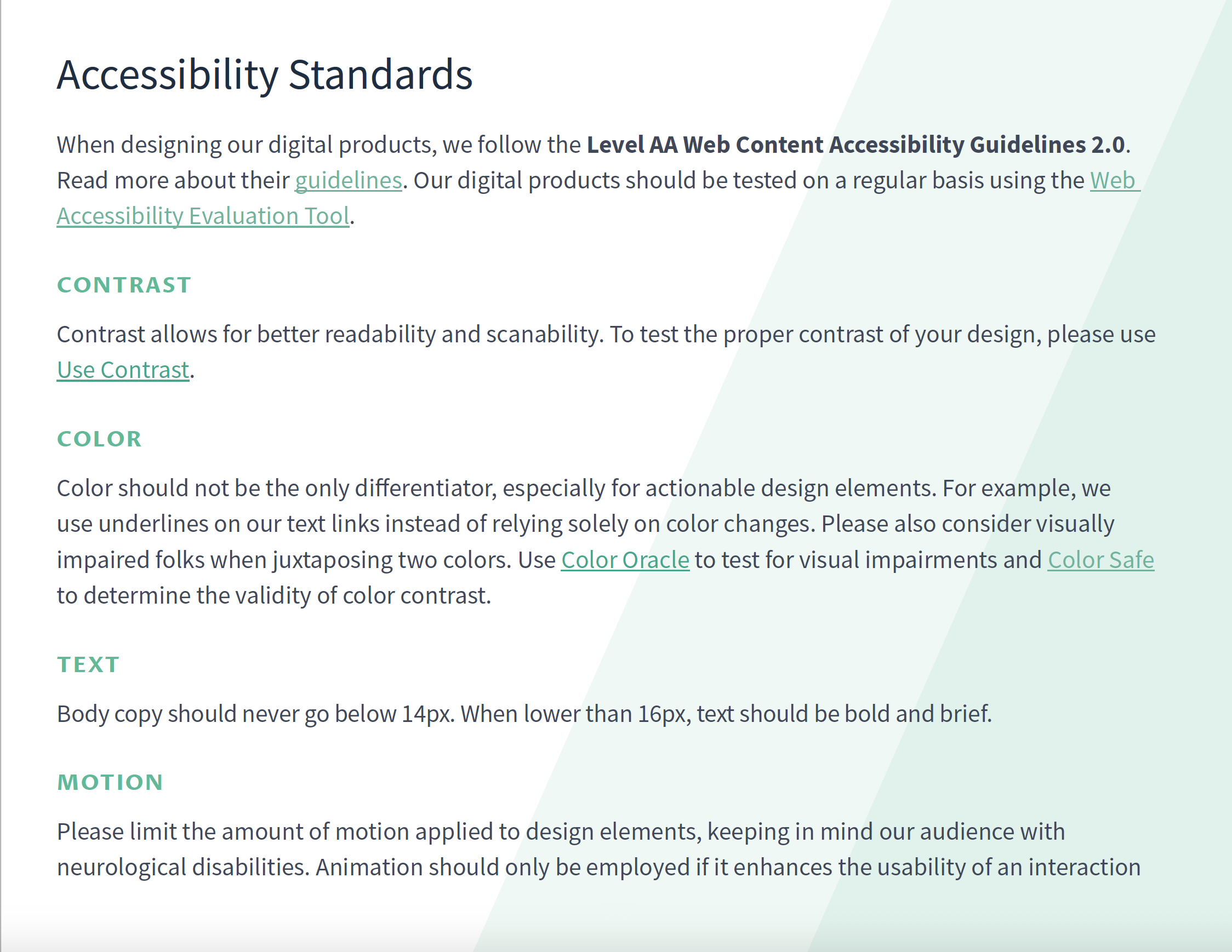
Merit America's learners come from all walks of life, and the same could be said for our overall audience. Knowing this, I used it as an opportunity to introduce the idea of applying accessibility standards to the company's brand from day one. Below is a page from our brand guide outlining such standards.
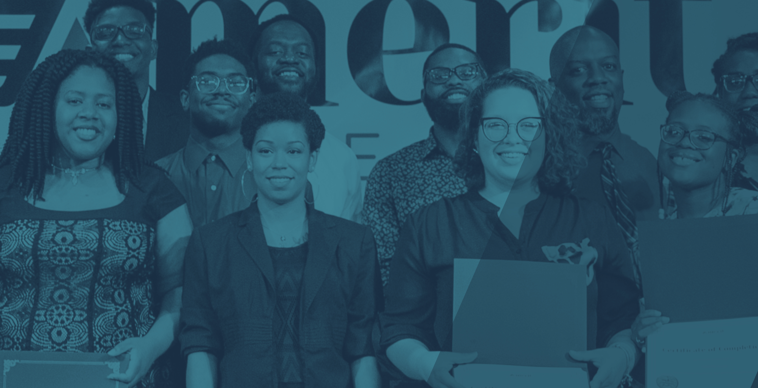
At the finale of our Alpha Cohort, our team hosted a graduation ceremony to celebrate their successes. This was our first opportunity for professional photography with which we could continue to promote our brand. Once we began growing our inventory of custom photography (primarily learner and employee headshots, graduation ceremony photography, and kickoff banquet photography), I established the guidelines of using saturated, learner-focused photography whenever possible. I incorporated duotoned photography when stylistically necessary. At this point, we still did not have custom photography of learners in their new workplace (for obvious, confidentiality reasons). However, with our newfound library of learner photography, we felt more comfortable relying on stock photography to illustrate the work environments our potential learners would experience.

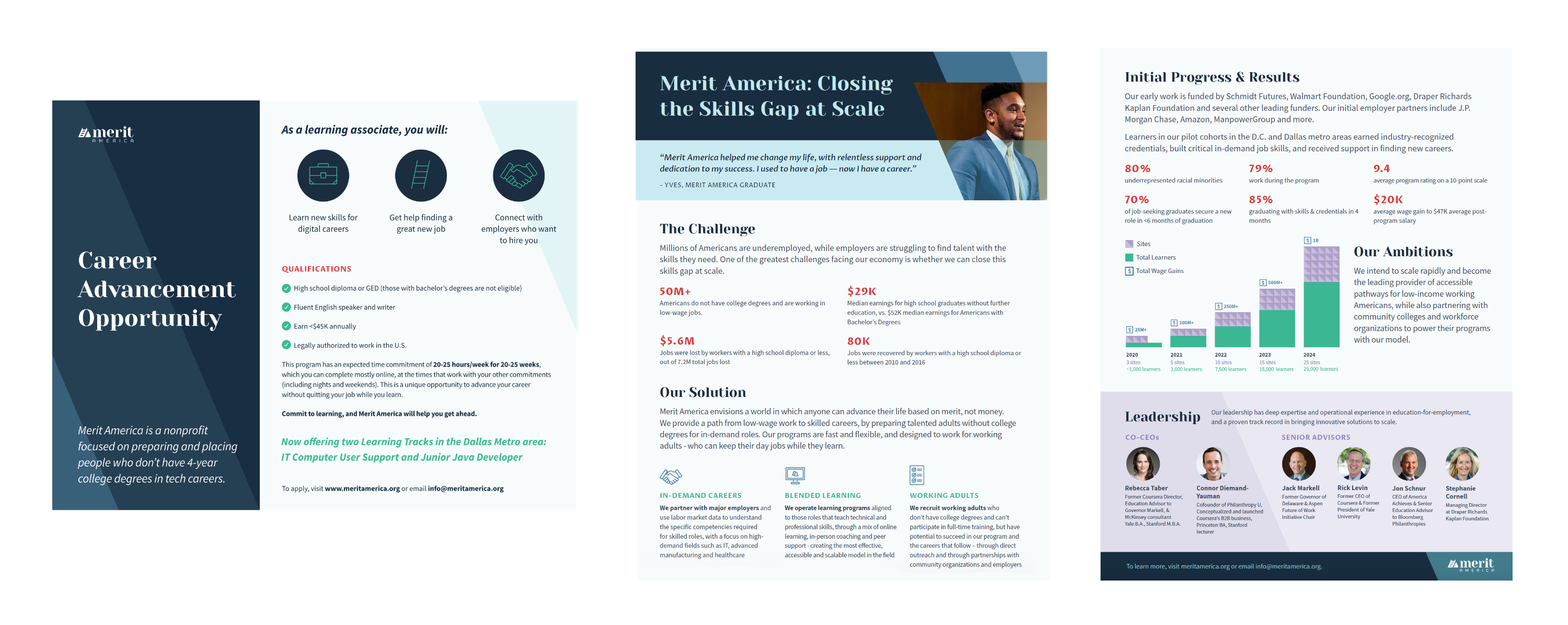
- We scaled our organization from $2 million in funding to $25 million in funding within 2 years
- We started our initial cohort with 6 employees and grew to an organization of 25+ employees within 2 years
- We went from serving 15 learners in our alpha cohort to serving over 1,000 learners among 3 sites within 2 years, which included adding a second learning track focused on Java Development
- On average, 82% of learners graduate from the program and earn industry-recognized certification
- Our learners increased their wages by $18,000 within 6 months of graduating from our program
- 89% of job-seeking graduates are employed or received a job offer within 6 months of graduation